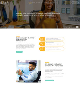
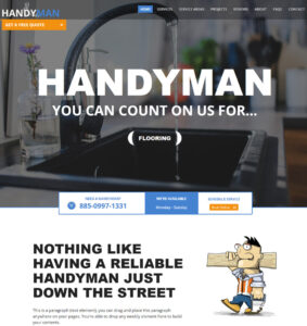
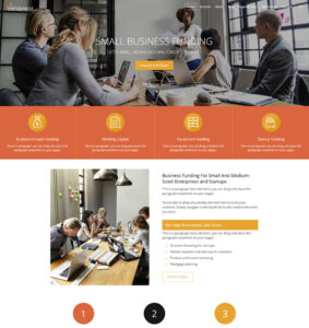
Struggling with a Weebly website and still trying to get the design right? The good news is, you don’t have to do it all alone. As Weebly Experts, we are happy to work with you to redesign your existing Weebly website, build you a new one or finish the one you started already at very affordable prices.
While Weebly makes it extremely easy to build website even for first-timers, it can difficult to create professional design that appeals to your target audience and other users in general.
The irrefutable truth is that you are competing with other business and organizations for website traffic and to have those traffic turn into businesses via phone call, or form submission, or appointment booking, or products purchase etc. And where your competitions have more professional and easier to use websites, you are 100% certain to lose out to them.
Still wondering if a professional website makes a difference? Still believe your website is manageable as is? Below are before and after examples of websites of other businesses and organizations who did every well on their own only to realize that their websites could use a professional design and presentation in order to appeal to their target audience.
10 Weebly Website Examples To Inspire Your Own
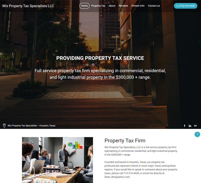
#1. Wix Property Tax
The client contacted us to redesign their Weebly website to look more professional. We used a modern Weebly theme to overhaul the website as requested by the client.
Want similar design for your website? Get a free quote here.
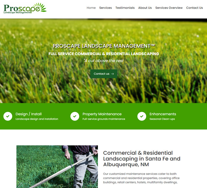
#2. Proscape
The overall design of ‘Proscape’ website shows what happens when a website design and presentation complements the services offered.
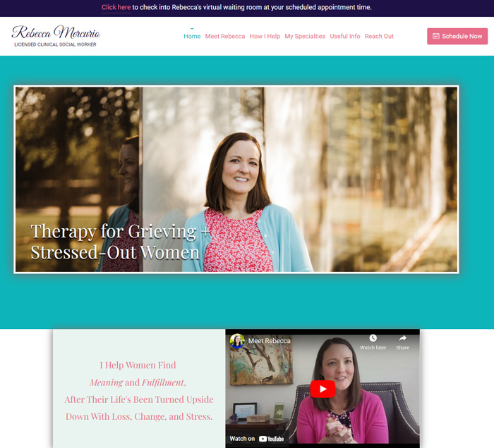
#3. Rebecca Mercurio
A good website designer can build a ‘good-looking’ website but a great website designer must be able to incorporate the client ideas and preferences as best possible into the finished website. The ‘Rebecca Mercurio’ website is clear example of a beautiful Weebly website designed and built 99% based on the client’s explicit preferences, especially as regarding the box-to-box appearance.
Want similar design for your website? Get a free quote here.
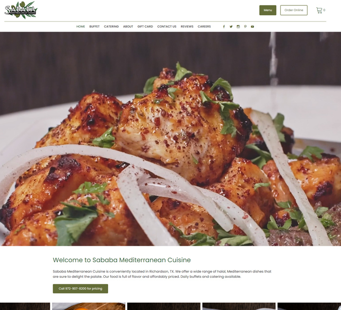
#4. Sababa Cuisine
Some businesses need more texts to sell their message, others need lots of visuals to sell. ‘Sababa Cuisine’ website is a perfect illustration of why food/restaurant websites should be graphic-driven.
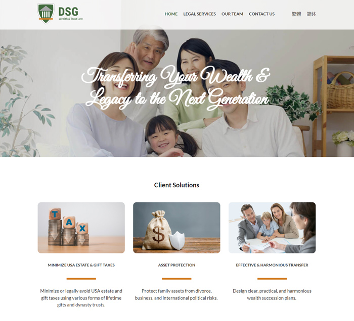
#5. DSG Trust Law
This website explains why the design doesn’t always have to be colorful, fancy and with ‘jumpy’ elements because sometimes less is more. And when dealing with professional and serious-minded audience, simplicity and ‘to-the-point’ is your best selling points.
Want similar design for your website? Get a free quote here.
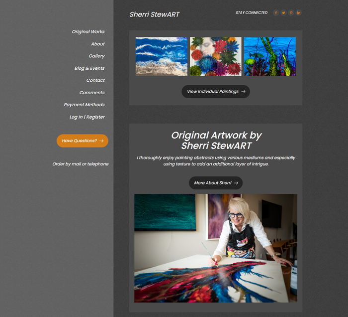
#6. Sherri StewART
When a mix of old-schooled/old-fashioned design with a semi-modern design works perfectly for the intended purpose.
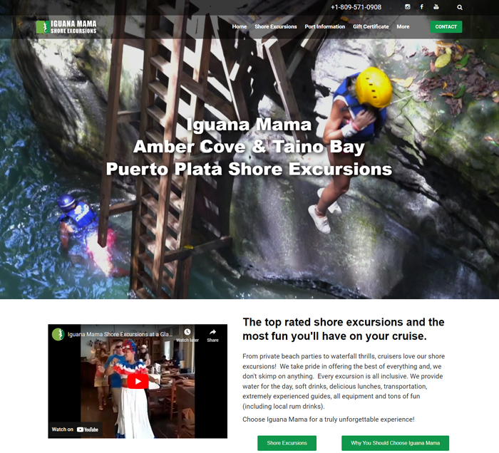
#7. Iguana Mama
Know your audience! That’s an important message when your best selling point is to focus more on the adventure and the entertainment value of your business than a “pixel-perfect” design of the website.
Want similar design for your website? Get a free quote here.
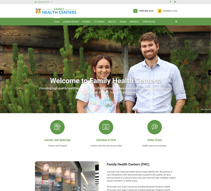
#8. FHC
For the FHC website, the primary objective is creating informative web pages for its user, ensuring ease of use and ease of finding information about its services, providers and locations. Listening to the client is crucial to delivering a website that doesn’t just look professional but works for the client.
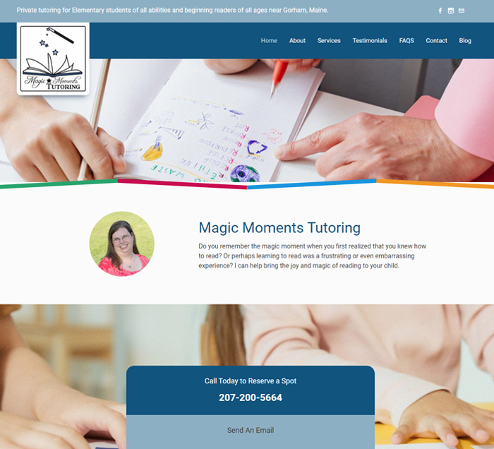
#9. Magic Moments Tutoring
Creating the right design for the intended audience is key to converting website visits into business. This is one of those occasions where a colorful design must be prioritize.
Want similar design for your website? Get a free quote here.
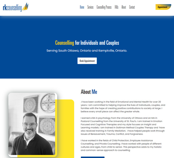
#10. RK COUNSELING
Shows how a clean & simple looking website can be created using available contents. Because the client will not always have all the texts/images in the world, a good designer should be able to create an effective website that informs and appeal to targeted audience using available contents, however minimal.
Still happy with your own Weebly website or would you like to work together with an expert to redesign/recreate your website to look better and be more effective? The first step is to request an obligation-free quote just to see what can be done differently.

